
What is W3C?
The World Wide Web Consortium (W3C) is an international public-interest non-profit organization that creates global technical standards that ensure digital products such as websites, apps, and electronic documents are accessible to people with disabilities.
So ultimately, W3C provides guidelines for designing digital products to be inclusive and usable by everyone, regardless of their physical or cognitive abilities. Web Content Accessibility Guidelines (WCAG) are the international standard explaining how to make web content more accessible to people with disabilities which was introduced by W3C.
What is Color Blindness?
Color blindness, also known as color vision deficiency, is when someone can't see colors the way most people do. This condition makes it tough to tell certain colors apart, which can affect how they see the world and interact with everyday tasks. Below are some types of color blindness:
Red-Green Color Blindness
This is the most common type of color blindness. People with red-green color blindness cannot distinguish between shades of red and green because for them, the shades of red and green are both become lighter.
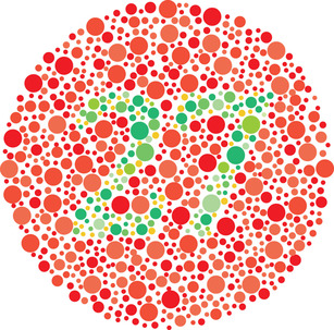
Example
A person with red-green color blindness trying to distinguish between a red stop button and a green start button on a machine.This person may see these colors as similar shades, lead to confusion and mistakes when operating the machine.
Blue-Yellow Color Blindness
This less common form affects the ability to distinguish between blue and yellow hues. There are 2 types of this color blindness: tritanomaly and tritanopia
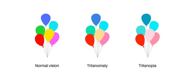
Tritanomaly
Reduced sensitivity to blue light, making blue appear greener so people find it hard to distinguish between blue - green
Example
A person with tritanomaly looking at a sunset by the ocean. While most people see distinct blue water and a yellow-orange sky, this person struggles to differentiate between the blue of the water and the greenish hues of the sky.
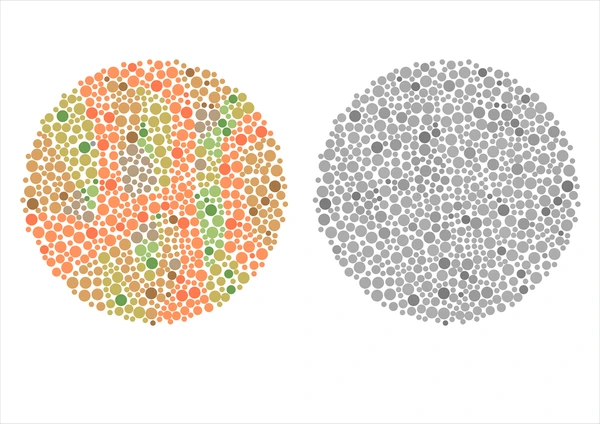
Tritanopia
Absence of blue cone cells, causing blue to appear green, and yellow to appear violet or gray so people cannot tell between blue - green, and yellow - pink
Example
A person with tritanopia trying to navigate a color-coded subway map. The map uses blue lines to indicate one route and green lines for another. So this person is having difficulty following the correct route, potentially leading to confusion and missed stops.
Complete Color Blindness
This is when people see no color at all. They see things with shades of gray ranging from black to white, and sometimes their eyes are sensitive to the light.
Example
A person with complete color blindness attempting to differentiate between traffic lights. This person perceives all colors as shades of gray, so this makes it challenging to determine when to stop, slow down, or go, as the color cues are not visible.
Some Color Combinations to Avoid for Color Blindness
To maintain accessibility standards, let's skip these color combinations in the designs:
Green – Blue
Green – Yellow
Green – Red
Blue – Purple
Blue – Gray
Green – Brown
Green – Gray
WCAG Colorblind Accessibility Guidelines
Criterion 1.4.1 of WCAG offers guidance to ensure accessibility for individuals with color blindness. It emphasizes the importance of making conveyed information accessible to all users, including those with color vision deficiencies.
A good designing for color blindness should include the following standards:
Text Labels
Avoid color combinations that can be hard for one with color blindness. Ensure that users can quickly locate information conveyed through color differences by providing clear text labels.
Furthermore, any information conveyed through color should also be available even without color.

In the picture, the words "More info" are displayed in white text on a black background. This color combination creates a high contrast that makes the text stand out prominently. High contrast like this is highly recommended.
Patterns and Textures
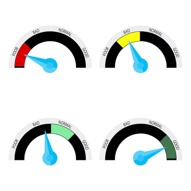
Using patterns, textures, or other visual indicators alongside color to convey information effectively. Consider using color-coding standards for better clarity.
Below is the gauge evaluating levels from bad to good, with each level represented by a specific color. For example, if the color is red, it means the level is 'Poor.' Yellow indicates 'Bad', light green represents 'Normal' and deep green signifies 'Good.'
Icons and Symbols
Using icons or symbols alongside colorblind-friendly palettes. It's advisable to accompany these with color-coding standards for improved accessibility.
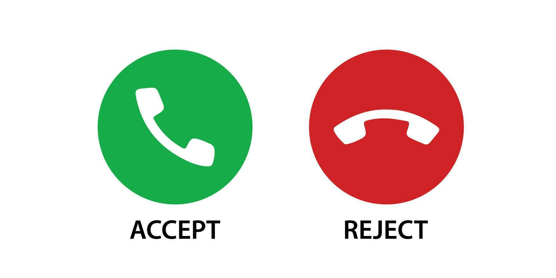
These buttons typically appear when you receive a call. The phone icon pointing up indicates you want to accept the call, while pointing down means you want to decline it. Using green - white and red - white for these icons creates a good combination for people with color blindness
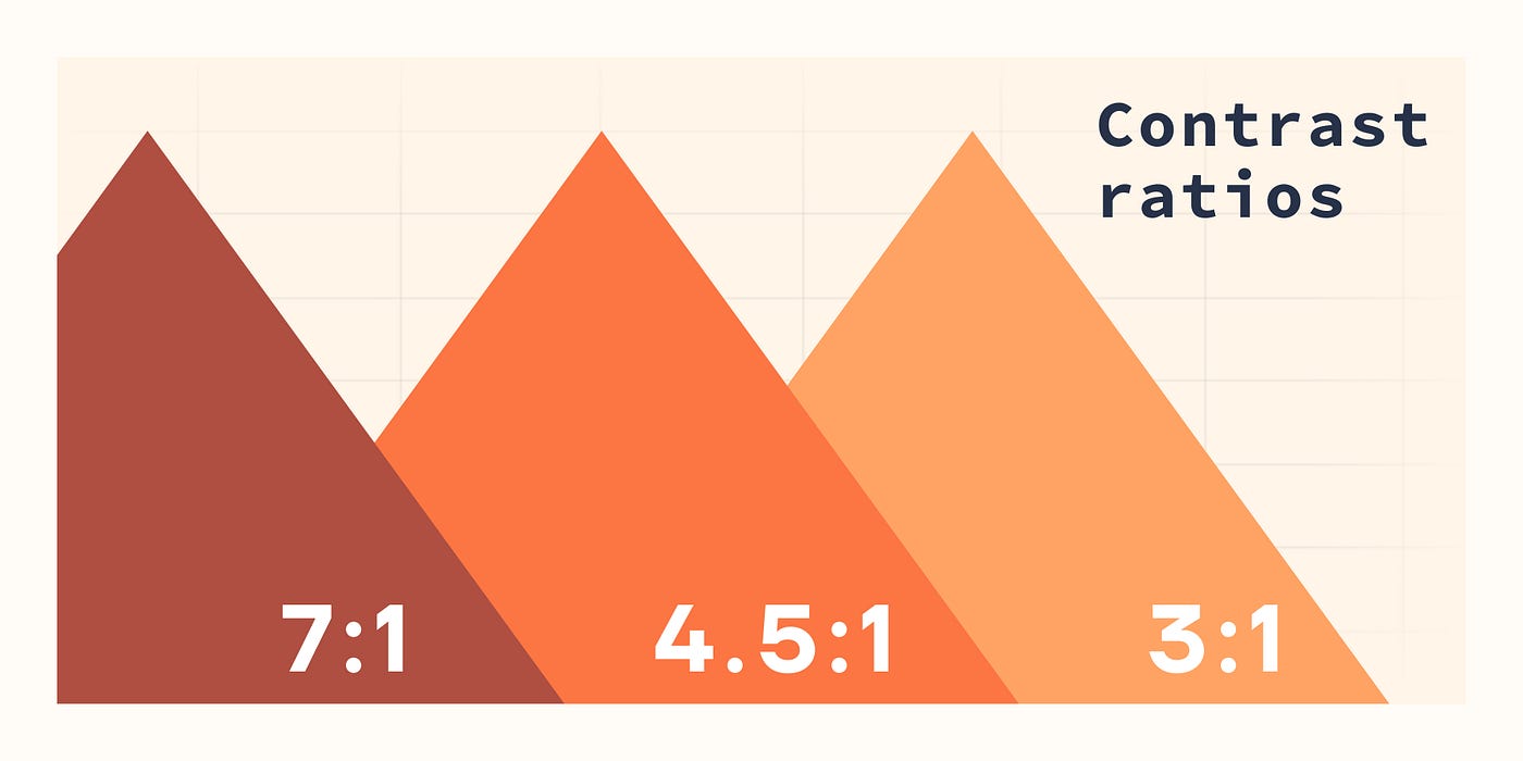
Contrast Ratios
Ensure sufficient contrast between colors by maintaining a contrast ratio of 3:1 or greater. Additionally, consider using inverted color schemes for distinguishing elements.
There are many contrast checker tools available that help ensure your website meets accessibility standards. These tools analyze the color contrast between text and background, ensuring it is sufficient for readability, particularly for users with visual impairments or color blindness.
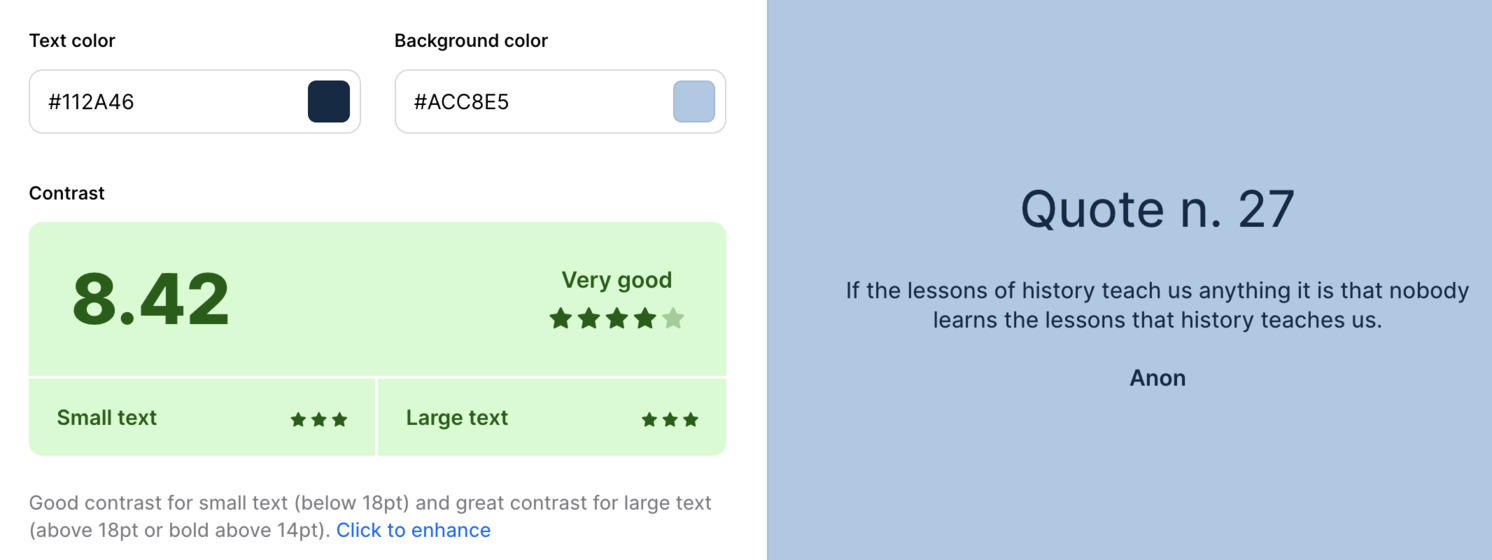 Good contrast ratio
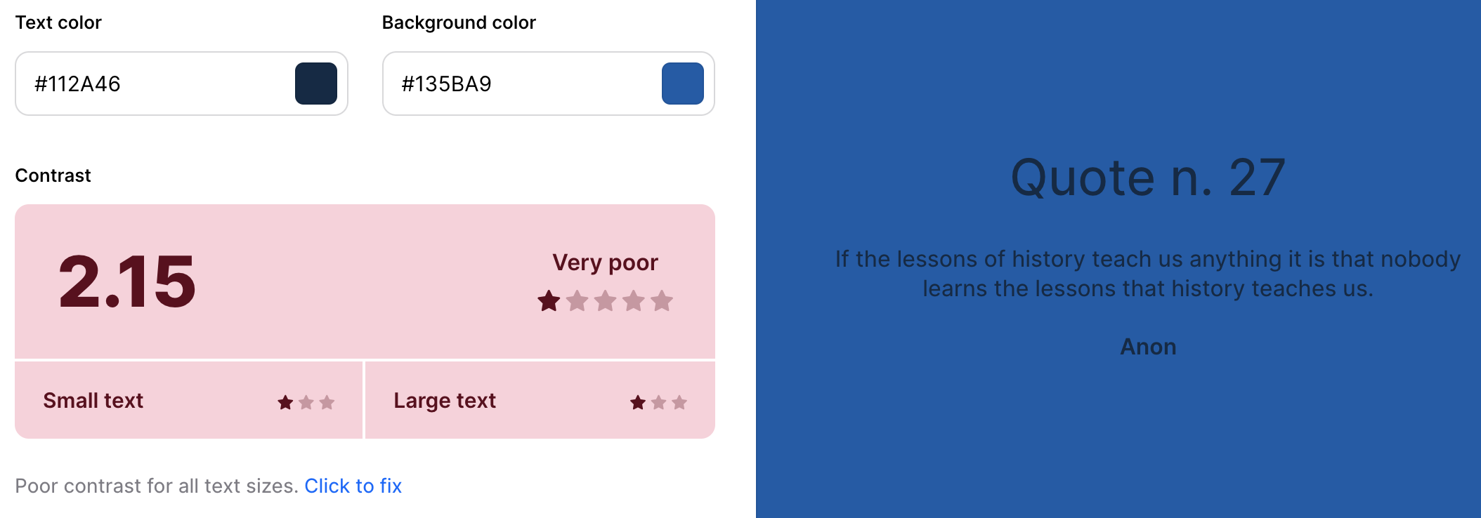 Bad contrast ratio
Interactive Elements
Avoid relying solely on color to identify links, buttons, or interactive elements. Provide alternative visual indicators such as underlines for links or borders for buttons to enhance accessibility.
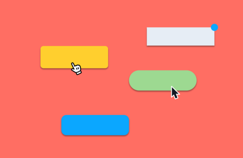
When you hover over a button, the mouse cursor changes both its shape and color to indicate that the element is interactive.
Testing Your Website's Accessibility
To ensure your website meets accessibility standards, it's crucial to thoroughly evaluate its accessibility. There are some methods for assessing compliance with accessibility guidelines.
Using Web Accessibility Evaluation Tools
To ensure your website meets accessibility standards, consider employing trusted evaluation tools:
WAVE Web Accessibility Evaluation Tool
Developed by WebAIM, which has been trustworthy in the field of web accessibility solutions for many years, WAVE has earned a stellar reputation. It's even used by the Office of Civil Rights to check web pages for accessibility issues.
Keep in mind that WAVE can't ensure if your web content is fully accessible. It's a tool designed to mainly assist in evaluating the accessibility of your web content.
Lighthouse
This tool offers a comprehensive analysis of various aspects of your website, including accessibility. It provides valuable insights into common accessibility issues and is user-friendly, making it accessible to users with varying technical expertise.
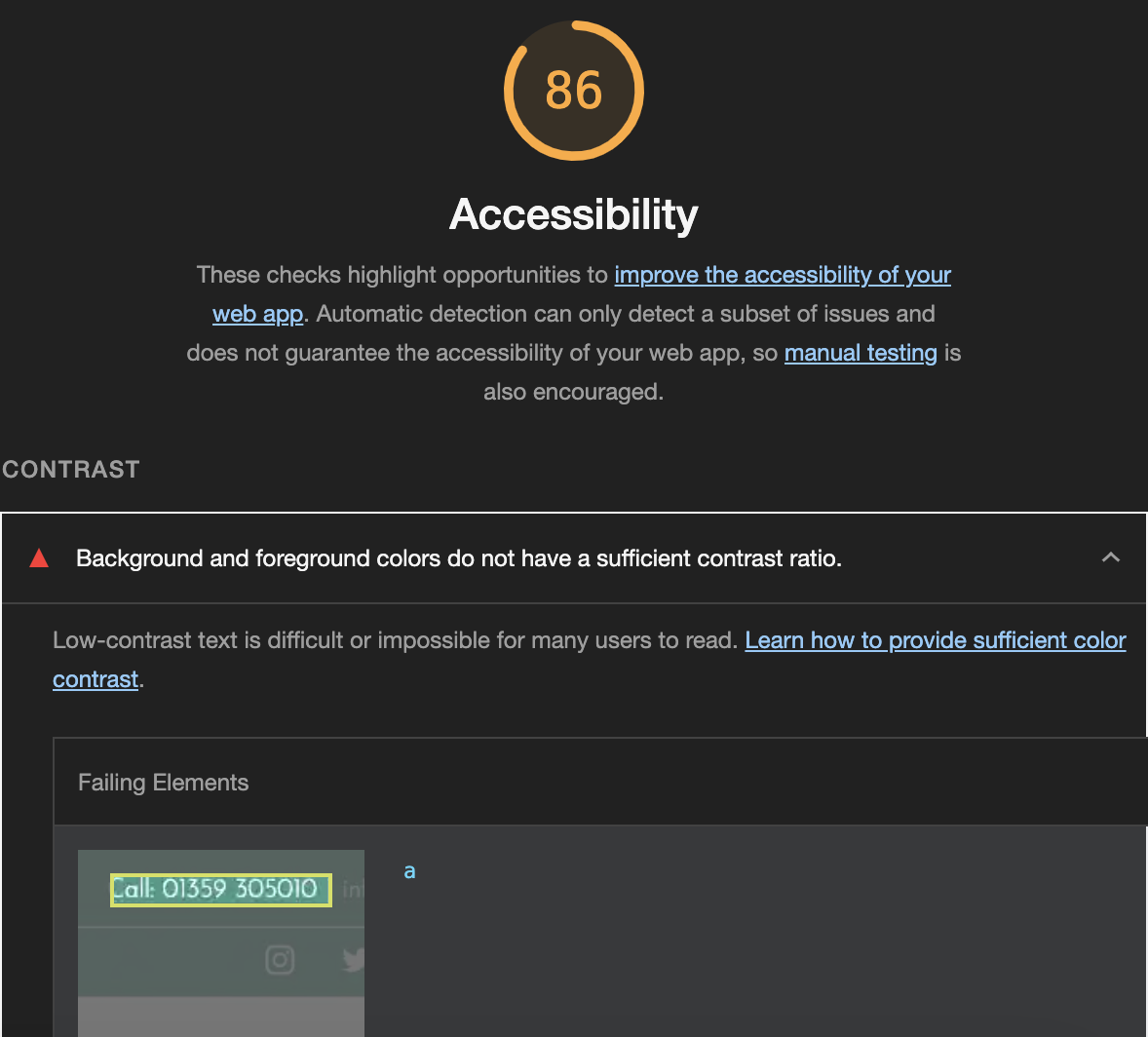
Here is the test result from Lighthouse. The report points out low color contrast errors, noting that the white text on a light green background makes it difficult to read.
Using Shopify Themes or ADA Apps
For Shopify store owners, there are two effective ways to comply with accessibility:
Using Shopify Themes
Many Shopify themes are designed with accessibility in mind. These themes come with built-in features that address common accessibility issues, including the design for color blindness
Using ADA compliance widgets
Alternatively, you can use ADA compliance widgets which are available in the Shopify App Store. These apps are specifically designed to help identify and fix accessibility issues, including those related to color blindness.
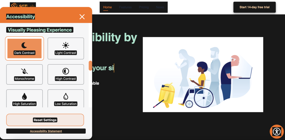
ADA WCAG Accessibility Widget offers features specifically designed to assist individuals with color blindness. Users can adjust color contrast through the Visually Pleasing Experience section, with options like Dark Contrast and High Contrast.
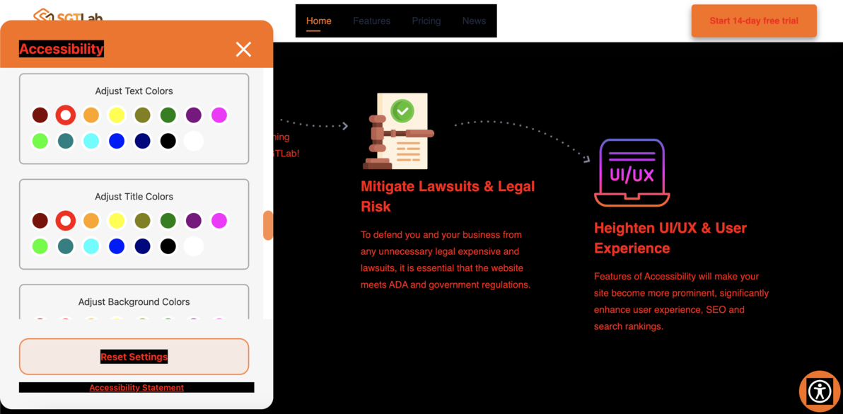
Additionally, users can modify the color of the text or the background of the page. This allows them to change colors they find difficult to see into ones they prefer, enhancing their overall experience.
Conclusion
Prioritizing accessibility for individuals with color blindness is a step towards creating a better online world. This dedication not only meets legal requirements but also reflects a commitment to valuing and accommodating all users, ultimately contributing to a more equitable and welcoming digital environment.

Related articles
 14 May, 2025
Boost Product Visibility in ChatGPT: A Complete Setup Guide
Sometimes, customers are just one step away from buying—but then they leave. Maybe they got distracted. Maybe they weren’t sure. Whatever the reason, that exit click doesn’t have to be the end of the story.
14 May, 2025
Boost Product Visibility in ChatGPT: A Complete Setup Guide
Sometimes, customers are just one step away from buying—but then they leave. Maybe they got distracted. Maybe they weren’t sure. Whatever the reason, that exit click doesn’t have to be the end of the story.
 09 May, 2025
Exit-intent Popup Shopify Guide: Keep Visitors from Leaving your Store Without Buying
Sometimes, customers are just one step away from buying—but then they leave. Maybe they got distracted. Maybe they weren’t sure. Whatever the reason, that exit click doesn’t have to be the end of the story.
09 May, 2025
Exit-intent Popup Shopify Guide: Keep Visitors from Leaving your Store Without Buying
Sometimes, customers are just one step away from buying—but then they leave. Maybe they got distracted. Maybe they weren’t sure. Whatever the reason, that exit click doesn’t have to be the end of the story.
 29 Apr, 2025
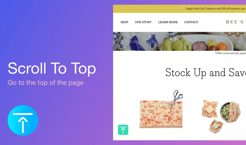
How to Add a Back to Top Button to Make Your Shopify Store Smoother and More User-Friendly
Users often have to scroll endlessly on long product or blog pages to return to the top. This friction can hurt navigation and overall user experience—especially on mobile.
29 Apr, 2025
How to Add a Back to Top Button to Make Your Shopify Store Smoother and More User-Friendly
Users often have to scroll endlessly on long product or blog pages to return to the top. This friction can hurt navigation and overall user experience—especially on mobile.